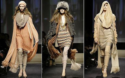
So: hands on on the board: I recommend you to bring all of the images you've collected on your workspace. This really helps visualize what you have, what you want to use and what you don't want to use.
The second thing you should do is to try to seth relashionships within images: same shapes/colors/textures really go well together and reinforce your theme.
Consider also the viewer is going to read your board top to bottom, left to right.
Place your images to match this criterias.
Your goal is to create a circular motion that will seamlessly lead the viewer eye from each image to the next, never getting tired of looking, because of the many elements it will find on it's way.
Another really basic rule is: big elements communicate better than smaller one. Proportions whithin different images is crucial for an effective communication.
Be sure to enlarge your main elements to make them visible among the others (you are creating focal points while you do so!).
After you set similar images groups, work on each separate one, fine tuning it.
For each group add a variety of examples (not only fashion related): a fabric detail, an object, a landscape, a location, a painting: showing similar images in terms of color/shape/texture ecc, but very different since they all are distinct things, makes your board successful. You are demostrating and bringing evidences of your trend in different products and fields, which reinforces your concept!
Use diagonal as guidelines where to put related images, color palettes, fabric samples: this creates movement and flow.
When you compose your board, be objective: use images for the sole pourpose of communication, not because you love them. Sometimes what is beautiful is not right for a board! Ask yourself questions: why this image is here? is it communicating what it should in the proper way? Be prepared to review the whole work and to redo it last minute! Sometimes it takes time to find the right path within the images! Pick images that speak universally, not only to yourself!
Sometimes less is more: EDITING is your friend, crowded boards are not professional, don't be afraid to delete, you'll use it next board!
Same time, fill the board with enough informations, poor boards are sad to look at.
Consider the board as a story: it needs a main hero, secondary characters, you have to describe what happens, why and when, and how the story will end.
On a trend board, our main character is our forecasted concept: we want to show how this concept develops i different fields, we want to show all of it's characteristics and it's possible future developments.
We don't want a boring story, with lookalike characters, missing connections, and no conclusion!!!
When you are done adjusting your layout, add your color palette, and fabrics and trimmings.
Please note every element has to relate to each other. Create gradients (usually lighter colors at the top and darker colors at the bottom, creates a nice ascending flow), and connect gradients to what's happening in the background.
Consider those are a very few guidelines for something that takes years of experiences.
But I wanted to share with you all of the secrets I know in the shortest possible time, and I hope you liked the tutorial.
Consider concept boards are one of the most effective tool for communicating ideas. They are then crucial in the life of ANY designer, and as soon as you will learn how to express your creativity through them, your professionalism will reach a really valuable level.
ENJOY!!!

.jpg)


